(01) Why It Matters
System-Wide Intelligent Visual Framework for Enterprise-Level Application Architecture
Claritas is the market leader in audience identification and optimization in the United States, resolving identity in real time for the ecosystem partners that the advertising industry runs on. Their own sales team was learning to pitch it from a 70-page training document.
That document is the whole problem in one artifact. Nobody writes seventy pages of internal training because they want to. They write it because the thing being explained has outgrown every shorter explanation, and the only remaining option is to explain all of it.
The platform underneath is on the order of 265 million US consumers, 580 million email records and 1.7 billion devices, feeding a multi-channel advertising engine that is ahead of most of the market. None of that is the difficulty. The difficulty is that a company whose advantage is sophistication still has to sell to people who will not spend an afternoon learning it.
A Complex Platform That Was Hard to Explain.
Claritas had accumulated the brand architecture of a company that keeps inventing things. Several named segmentation systems, proprietary identity technologies, an AI layer, an attribution layer and a distribution layer, each of them real, each valuable, each with its own name and its own history.
From the inside the structure was logical. From the outside it was a wall. A prospect could not tell where to enter it, which product answered their question, or how any piece related to the next. Assets built by different teams at different times made it worse, because each one described a part of the company without ever placing it inside the whole.
The failure mode here is quiet and expensive. Nobody objects. They simply stop following, and the business goes to whoever explained themselves faster.
This is a Foundation problem, in the language of the Brand-to-Revenue Performance System, and it is the reason Foundation sits where it does. Claritas had formidable capability in every other domain. When the architecture is not legible, that capability does not compensate for it. It amplifies the error, because every asset produced downstream inherits the confusion and spends real money distributing it.
One Slide That Explains the Whole System.
Deconstruct, rethink, re-strategize. Not redesign.
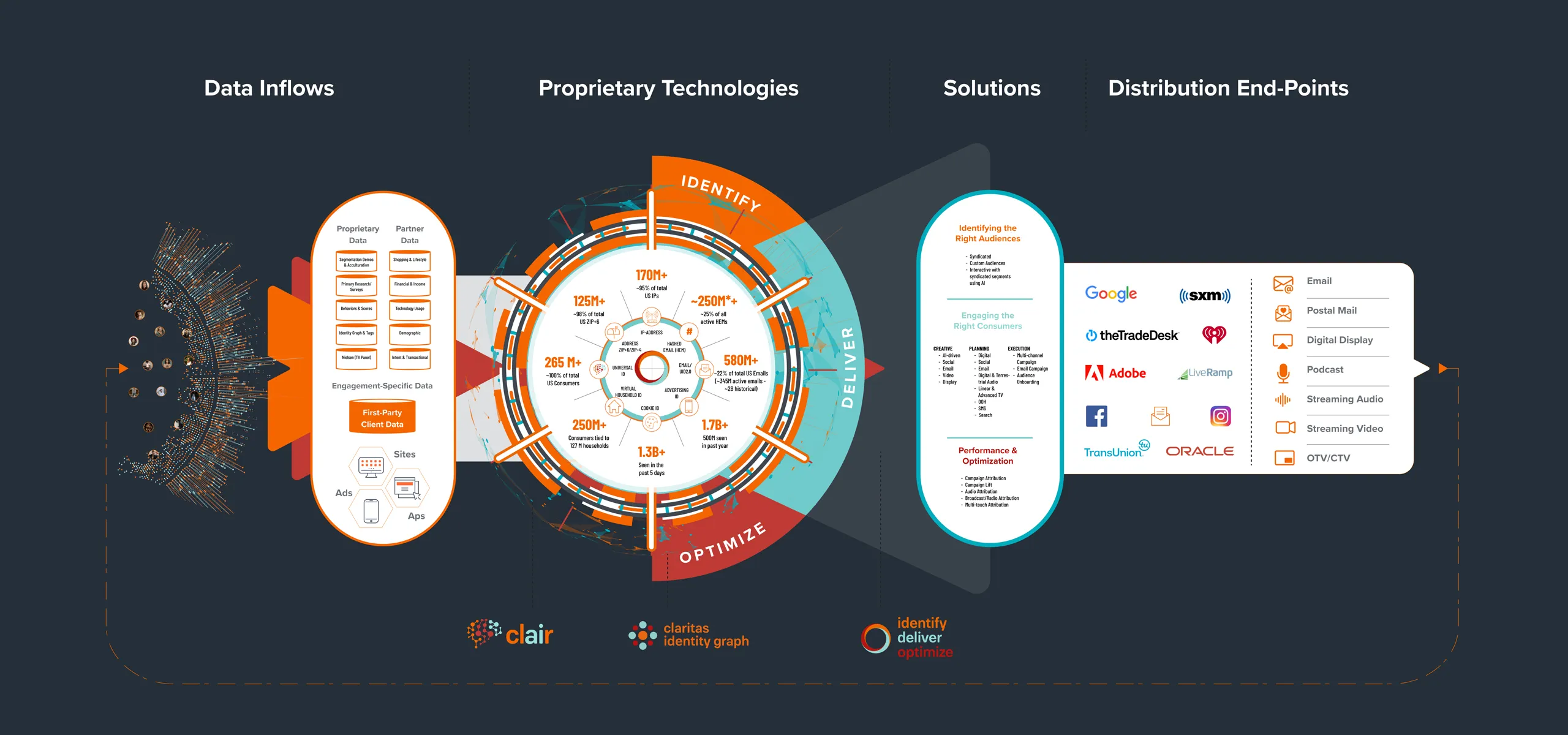
The goal was one high-level view: a single slide that explains the entire system at a glance, from data inflows through proprietary technologies and solutions out to distribution end-points. If a prospect can hold the shape of the company in their head for the length of a meeting, every subsequent conversation has somewhere to attach itself.
Then make that view scalable rather than final. The same visual logic had to branch down into core functionality, specific portals, market verticals and partner integrations, so the depth a particular audience needs is available without a different diagram being invented for it. One structure, examined at whatever resolution the room requires.
Visual Information Design.
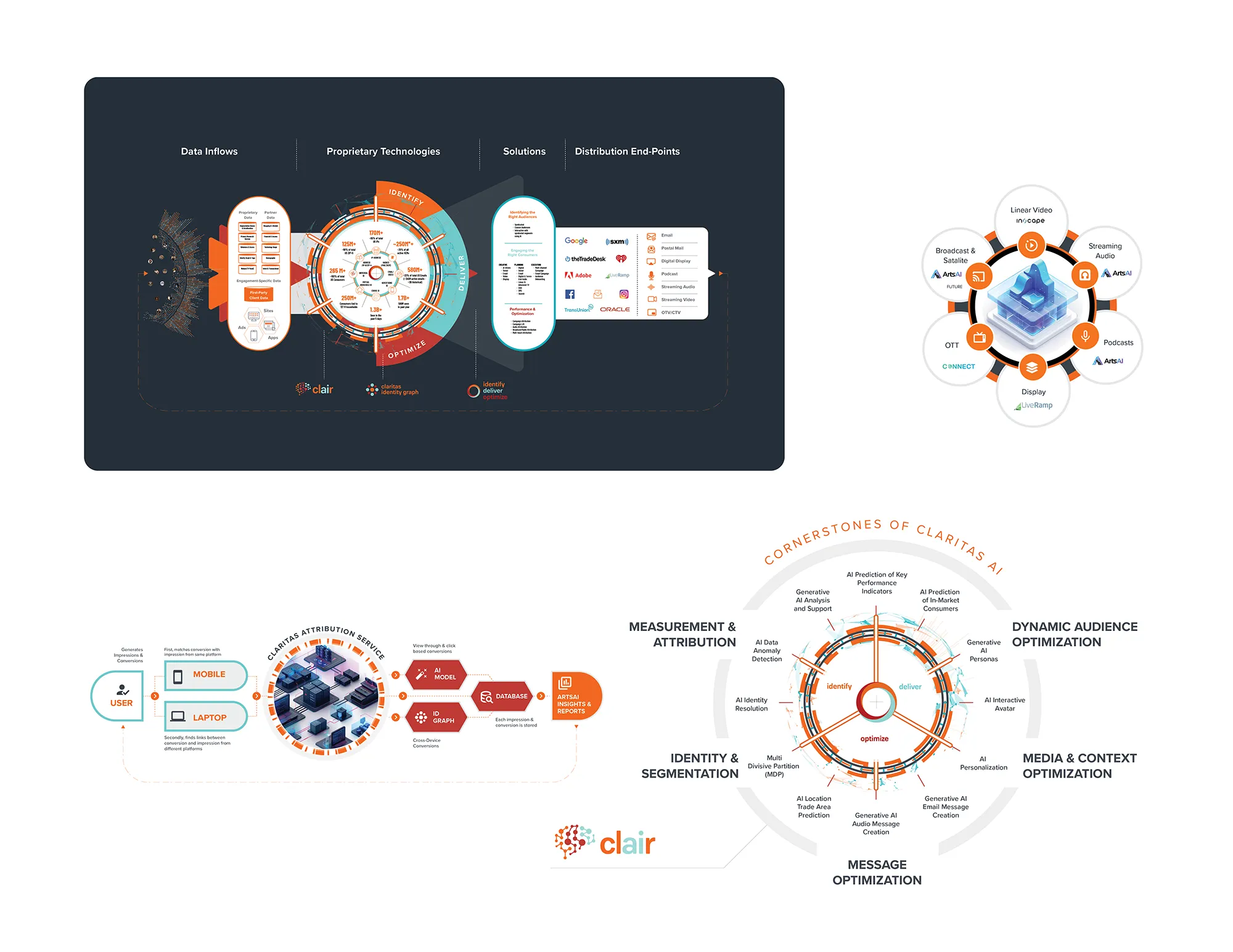
Underneath the top-level view we built the models that carry the technical argument: Claritas Real-Time Identity Resolution and the Claritas Attribution Service, each tracing the full path from initial data inflows to final distribution end-points.
These are not illustrations of the product. They are the product, drawn. A buyer evaluating identity resolution is asking a structural question about how records are matched, stored and acted on, and a diagram that answers it honours the question in a way prose cannot.
Rolling It Out Across the Company.
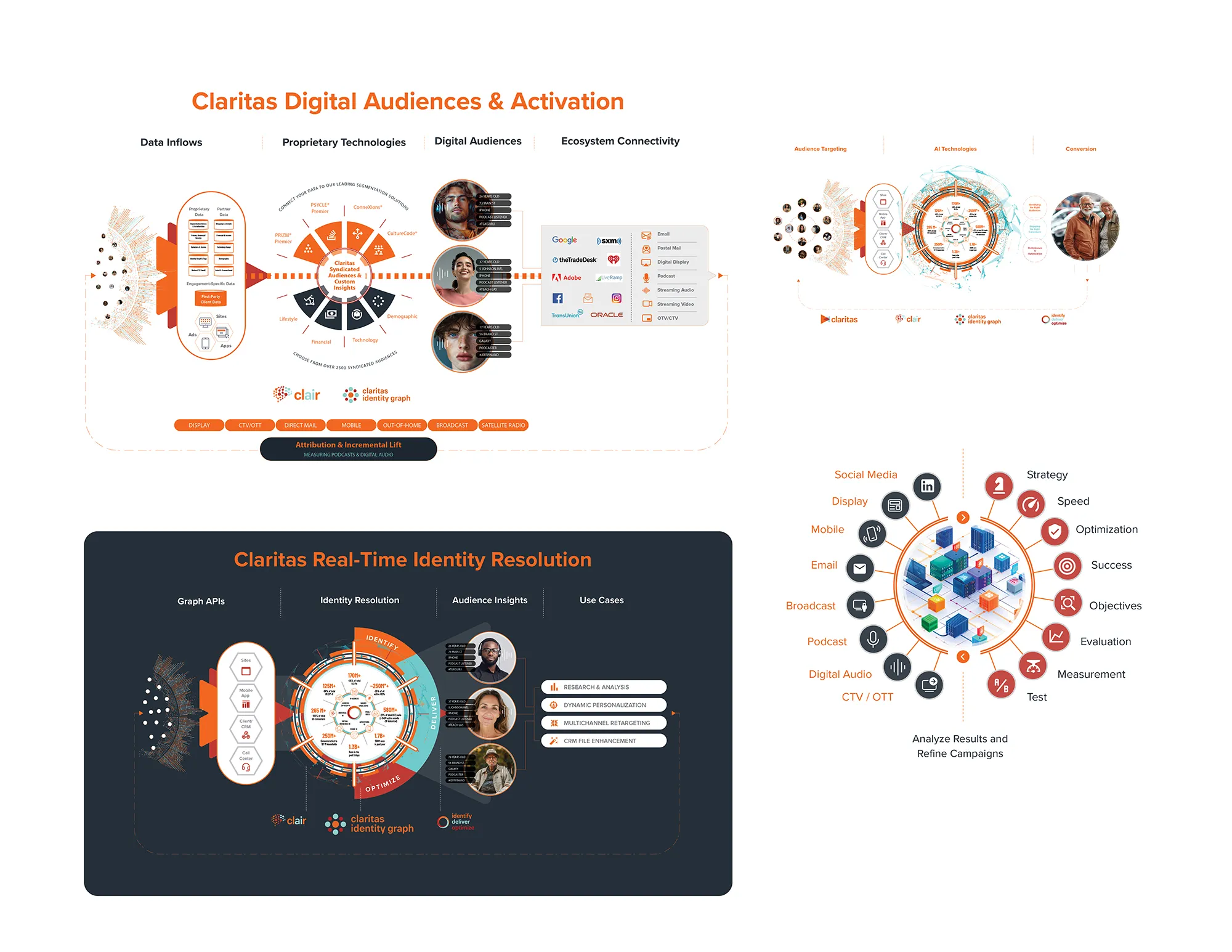
The system then had to hold everywhere. We scaled the visual language across presentations, offline and online assets, and video production, so that a deck built by one team and a video produced by another read as output from the same company.
That is what makes a visual system worth building rather than a single good slide. Consistency stops being something anyone has to enforce, because there is one place for every asset to read from.
The Results.
The work replaced the legacy training materials outright. What began as a request for creative support became the foundational visual language Claritas now uses across their presentations and marketing collateral.
The measure is not that the material looks better, though it does. It is that a 70-page document was doing a job it could never do well, and it no longer has to. The sales team stopped carrying the burden of translation, and the company's sophistication became something a prospect could repeat after one meeting.
Complexity was always the product here. Confusion was the only thing we removed.